In a previous post, I provided some background on this unique, limited-edition blue available from QoR Watercolors.
YInMn fills a gap between cobalt and ultramarine blue that I didn’t know existed. It is an ultra-granulating, transparent watercolor that runs the spectrum from a light blue-gray to a rich lapis blue. However, due to the semi-weak tinting strength, it doesn’t quite reach the level of saturation as a strong cobalt or ultramarine.
For the wheel below, I chose some ultramarines and cobalts that I thought would offer a good basis of comparison. I used Arches Rough watercolor paper to showcase the granulation of the paints used.
The colors I used are listed below. YInMn fills the center of the wheel.
QoR: Ultramarine — PB29
Daniel Smith: Ultramarine Blue — PB29
Daniel Smith: French Ultramarine — PB29
Winsor & Newton: French Ultramarine — PB29
Winsor & Newton: Ultramarine Green Shade — PB29
Mijello Mission White: Ultramarine Deep — PB29/PV15/PV3:2
Sennelier: Ultramarine Deep — PB29
Sennelier: Ultramarine Light — PB29
White Nights: Ultramarine — PB29
Daniel Smith: Cobalt Blue — PB28
M. Graham: Cobalt Blue — PB28
Winsor & Newton: Cobalt Blue Deep — PB74
Sennelier: Cobalt Deep — PB72
White Nights: Cobalt — PB28
Mijello Mission White: Cobalt — PB28
YInMn looks similar to the colors on this wheel but is different enough to create mixes I have not been able to achieve with any ultramarine or cobalt I’ve used. In a future post, I will be writing about mixing with YInMn. Stay tuned!
In September of last year, I was able to snag two tubes of QoR’s YInMn Blue. Several years ago, I learned about the fascinating history of the pigment and was hoping that I could get my hands on it someday. Thank you, QoR, for making my dreams come true.
The interesting story of this new blue pigment began in a lab at Oregon State University. It was discovered by accident by chemists who were working on an unrelated project. It took several years for companies to start producing artists’ paints because the materials (Yttrium, Indium and Manganese) are expensive to procure. An Artnet article explains the history in more detail if you are interested.
Fast forward to 2020 — QoR announces that they are producing a limited quantity of YInMn Blue watercolor, acrylic, and oil paints. As soon as the announcement was made, I called them to reserve 2 tubes. It took a couple months, but they finally showed up at my doorstep.
As far as I know, they are still producing the color in small batches. It is not available in stores, so if you are interested you have to contact QoR directly. You can call them at 800-959-6543 to try to order. The tubes are a little pricey ($14 for a 5ml tube), but they are worth it.
In future posts, I will share my thoughts on the paint but in the meantime, here is a swatch so you can see how beautiful it is.
My very first YInMn splat, fresh from the tube.Look at that dispersion!This is definitely one of the most granulating blues I own.There’s magic inside!
If you are going to try to get some from QoR, I wish you the best of luck! I heard the waiting list is long, but it’s worth it!
I heard about the obscure Mijello Mission White Class in a watercolor product review group and was so intrigued that I immediately purchased a set. They are advertised as a hybrid of gouache and watercolor. The details provided in the product insert explain what this means:
Top of insert. Bottom of insert.
The set comes with 34 colors in 15ml tubes. The color range is well-balanced, but I was disappointed that black and white paints were not included in the set. If you don’t have white and black gouache on hand, I’d recommend that you purchase them.
The box it comes in is beautiful. I’m a sucker for anything holographic.
Front of the box.
The inside cover provides a list of colors included in the set which is a helpful quick-reference tool.
Inside cover of the box.
Here is the complete set of tubes:
Mijello packs a lot of important information on the individual tubes, which is very helpful when choosing colors. The front of the tube includes the paint’s name, the manufacturer’s number, and the price group. The back of the tube lists the pigments, the lightfastness rating, and the transparency.
Top: front of tube; Bottom: back of tube.
The consistency straight out of the tube is like watercolor, not gouache. I expected the paint to be a bit thicker but most of the paints are the same consistency as their Mission Gold counterparts.
So, how are these different than traditional watercolors? The answer is…I’m not sure. There’s scant information online and it’s not explained well.
The main difference I’ve observed is that they use bright – sometimes fugitive – pigments so they are less lightfast than other watercolors. If lightfastness is a concern of yours, then you shouldn’t purchase this set. However if you do much of your work in journals, which I do, the lightfastness ratings are not a deal breaker.
Another thing I noticed is that the pigments aren’t consistent with colors of the same name by Mission Gold. For example, here’s a swatch comparing the Mission Gold and Mission White versions of Bright Opera. MG uses BV10 and PR 122 while MW uses only BV 10. I only see a very subtle difference between the two. Mission White is slightly more vibrant.
Here’s another example of Cerulean Blue —which isn’t technically cerulean. (PB15:3 is phthalo blue, while PB35/PB36 are true cerulean pigments.) In any case, Mission White adds a pigment – PB17:1 – which is also a phthalo blue. It adds a bit more depth and vibrance, but the difference between the two is not overwhelming.
The Verdict: I’m still trying to figure these paints out. I’m confused as to why they are advertised as a hybrid of gouache and traditional watercolors because only a few of the colors are listed as even semi-opaque. You even have to supply your own black & white gouache. They preform nearly – if not exactly – the same as their Mission Gold counterparts.
My guess is that they want to sell a more vibrant, less lightfast product marketed to people who work primarily in journals or digitize their work.
For this reason, I’m going to add a buyer beware: if you need watercolors that will withstand the test of time, you should avoid these. There are other options for vibrant watercolors, including the regular Mijello Mission Gold paints.
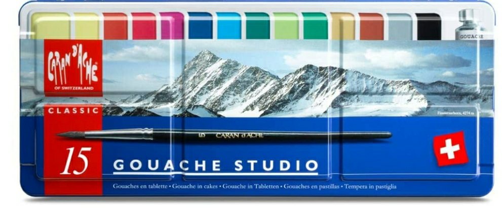
I’ve never owned a set of gouache but, based on a glowing recommendation, I decided to purchase a 15-color set of Caran d’Ache Classic Gouache. As soon as I opened the package, it was love at first sight. The presentation is beautiful.
The set comes with 14 colors of gouache and a tube of white. They include a size 8 synthetic brush which I liked very much. There are also 5 large wells on the lid for mixing.
The only qualm I have with the presentation was the absence of color names on the pans. It required a bit of research to identify the colors. The pans include the product numbers on the side in very small print, so I had to find the official chart with corresponding color names.
Caran d’Ache Gouache color chart.
Before I did swatches, I labeled my pans with the information I found for easy identification when I am painting.
My swatches.
I found the pigment information on Wet Canvas which will be helpful when mixing colors. Note that they call product number 090 “Magenta” while the official name is “Purple.”
The Verdict: This is a very useful, versatile set of paints. It contains warm primaries consisting of Yellow (010), Vermilion (060), and Ultramarine (140). There are also cool primaries: Lemon Yellow (240), Purple (090), and Carmine (080). These colors alone will give you a wide range of hues. I anticipate the other colors in the set will produce lovely mixes as well.
Caran d’Ache does it again. I was never very interested in gouache, but I certainly am now.
I just wanted to share some pretty pictures I took of the Finetec Pearlescent Flip Flop Colors. They are so beautiful and fun to play with! They are only available in the 24-set of the pearlescent colors so it’s a good excuse to upgrade!
FinetecPatina Flip FlopSide angle of Patina showing the chrome effect. A splat of Patina over Mission Gold Sap Green.Finetec Twilight Flip FlopTop view of Twilight.
I’ve been spending all my free time testing my new Faber-Castell Albrecht Dürer Watercolor Pencils. I’m going to write a longer review but I wanted to share some pictures of my tests.
Activated pencils on Canson Watercolor XL.Arches RoughInactivated on Canson XL
I finished the first page of my scrapbook over the weekend! The most fun part of this project is choosing the right piece of scrap to make an interesting composition.
This scrap on Arches Rough was a tester of Sennelier Indanthrene Blue mixed with Paul Rubens glitter paint and Finetec Iridescent Paint. The background is a wash of Mission Gold Indigo and Sap Green, with a little bit of Daniel Smith Mars Yellow. It looks moody, like tears, and I thought it was an apt way to start my scrapbook. I suffer from depression and art is very therapeutic for me. I don’t want the whole project to display my sadness—I want to keep it upbeat and colorful—but I do want it to be a true representation of who I am.
Anyway, here it is! I was really impressed with how the page of the Ranger Dylusions Flip Journal held up to the watercolor wash.
I set aside some time today to re-purpose colorful watercolor scraps to make some tiny art.
Awhile back, I made this dotty watercolor test out of some new Winsor and Newton Professional Watercolors I bought. I can’t remember what colors I mixed to make the background. I had it left over from a different project. The other colors are all Winsor & Newton straight from the tube and the list is as follows:
Manganese Blue Hue – PB15
Rose Dore – PV19, PY97
Indian Yellow – PO62, PY139
I used my beloved Arches Rough Watercolor Paper, which I wrote about in detail in a previous post (click here).
These are the steps I took to re-purpose this tiny scrap that was too colorful for the wastebasket…
Polkadotting the frame
My Spellbinder Platinum manual die cutting machine gets a daily workout. If you make tiny art, this is an invaluable tool to make mounts and frames. To make this frame, I used steel rule nesting dies to cut the ideal size frame for my picture. I used Astrobrights 65 lb/176 gsm bright white cardstock.
I decided that I wanted to make it extra dotty, so I used a Faber-Castell small-nib (0.3mm) Pitt Artist Pen to make tiny dots on the frame. The cardstock holds up well – there was no bleeding on the other side.
Closeup of the pre-glued frame
After I finished dotting the cardstock, I used Tombow MONO Multi-Liquid Glue to adhere the frame to the picture. Now that it’s dry, I get to find a home for it in my scrapbook!
I have a seemingly endless pile of color-test scraps in my studio that I couldn’t bring myself to throw away. They are so bright that it would be a shame to see them in a trash can.
Papercrafting is one of my other favorite hobbies so I decided to assemble a scrapbook comprised primarily of literal scraps.
A tiny selection of my mountains of scraps
I chose a Ranger Dylusions Flip Journal because the pages are made of thick cardstock that will accept water and ink. I haven’t tested it yet, but I’m fairly certain that it won’t buckle or bleed based on the thickness and texture of the cardstock. I also liked it because it has a thick outer sleeve with an envelope attached to the inside. My only complaint about the journal is that the right-side corners are rounded which makes it difficult to put a decorative border on the edges.
I wanted to put a bright border on the inside and outside covers, so I painted ROY G. BIV squares using my beloved Sennlier L’Aquarelle paints on a long piece of Strathmore watercolor paper. I didn’t want to use thick cotton paper because I wanted to be sure the covers closed correctly.
Highly-pigmented, smooth, gorgeous Senneliers.
After the paper dried, I cut some 1″ wide strips to glue on the edge of the covers. It’s not perfect – I blobbed glue too heavily on one of the strips – but, despite the glue disaster, it turned out well.
Glue splat: lower left corner of the strip. *facepalm*Inside cover.Close-up of the inside cover. No glue blobs. I learned my lesson.
I’m probably going to put a few more things on the cover, but this was a fun Saturday project. Stay tuned for my progress!