I explained how I made these bookmarks in my previous post. As a testament of how easy they are to make with the right tools, I made another one in the same night!
I used colored pencil swatches for this one. The top swatch is Faber-Castell Polychromos; the middle swatch is Prismacolor Premier Soft Core; and the bottom swatch is Caran d’Ache Luminance .
I recently made some Caran d’Ache Neocolor II swatches and wrote about them in a previous post. I used Color Combo stamps from Waffle Flower to print the layouts and spent about 2 hours coloring them in.
If you aren’t familiar with Neocolor II, they are highly-pigmented water-soluble crayons. You can use them dry or activate them with water.
Finished Neocolor II swatches.
I love making things with my manual die cutter and I have a steel rule die from Waffle Flower (obviously one of my favorite suppliers) that I use to make tags. I decided to use some of these swatches to create a bookmark.
First, I cut out the swatches I wanted to use. Then I glued them to the tag. As a finishing touch, I added a tassel.
I was so pleased with it that I decided to start on another one! It was an easy project when using the right tools.
Prismacolor Premier colored pencil swatch on Canson XL paper.
I’m going to use Caran d’Ache Luminance and Faber-Castell Polychromos to do the other two swatches.
I’ve been putting my feelers out, trying to get an idea of what I want for my birthday this year. I like getting gifts that I normally wouldn’t buy on my own but I like to do research to make sure that it will have a perfect home in my collection of supplies.
I’ve been hearing outstanding reviews of Schmincke Horadam watercolors, but I’ve never tried them out. As it so often does, Amazon pulled through for me by offering a 140-color Schmincke dot card.
The packaging is absolutely lovely.
Outer envelope. Booklet cover.
One thing that was slightly disappointing was the small amount of paint they give you in each dot. I am used to the generous blobs of paint Daniel Smith offers on their dot cards. Even though the dots are smaller, I think that I will have enough to test the colors and have some left for accents in paintings.
Full card.
I can tell just by the deepness of the dried paint that these are highly pigmented. I’m so excited to start discovering new colors!
Caran d’Ache products are the crème de la crème of art supplies. Any item they manufacture – whether it be colored pencils, water-soluble pencils, graphite sticks, etc. – is a shining jewel in an art supply collector’s studio.
I was introduced to the brand while meandering through my local art store and stumbling upon a giant open-stock display of Neocolor II water-soluble wax pastels. At the time, I had no idea how to use them, but the vibrant colors beckoned to me. I picked up a tin and went to my studio.
There was a bit of a learning curve. Actually, I’m still learning different techniques. Today, though, I just felt like coloring, so I did some swatches.
I used Arches Rough Watercolor Paper which turned out to be an excellent choice. Because the paper is so toothy, I only needed to make a light pass to get adequate coverage for filling in the squares.
Eventually, I’m going to cut these out and put them in my scrapbook.
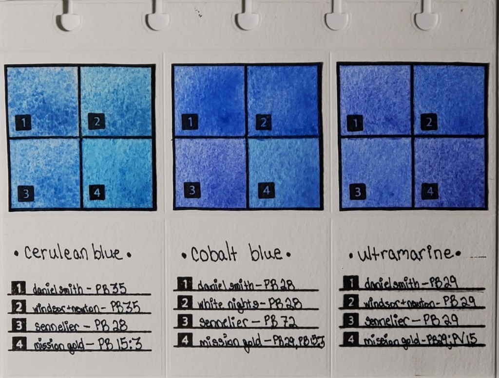
Left to right: Cerulean, Cobalt, and Ultramarine Swatches
I’ve been fascinated with how watercolor paints of the same name vary across brands, even when the same pigment is used. For example, you would expect Daniel Smith’s cerulean blue to look nearly identical to Winsor & Newton’s cerulean blue, right? As you can see from the photo, that’s not the case. I decided to do a study of how colors vary between brands. This deceptively simple-looking page actually took months to finish.
Here is the work that went into its creation:
I cataloged all of my watercolor paints into an Excel spreadsheet and noted properties like pigment number, lightfastness, transparency, staining, and granulation.
I used a die cutter to make swatch cards and the pages which I will eventually bind.
I swatched the paints I wanted to compare. Blues are my favorite, so I started with my most frequently-used
I used silicon stamps to assign numbers to the swatches for easy identification.
After I finish my pages, they are going to be bound in a little flipbook which I’m going to keep next to my desk for easy access to the comparisons.
The most important lesson I learned when I began my research is that color names are less important than pigment numbers. Instead of buying colors based on trade names, I look at the pigment listed on the tube to get a better idea of what the color will actually look like.
Stay tuned for new pigment comparisons! I’ve done swatches for Opera Pink, Viridian, and Lemon Yellow that I’m excited to share!
* I know that I misspelled “Winsor” in the pigment descriptions on the finished page. It will haunt me forever.