I explained how I made these bookmarks in my previous post. As a testament of how easy they are to make with the right tools, I made another one in the same night!
I used colored pencil swatches for this one. The top swatch is Faber-Castell Polychromos; the middle swatch is Prismacolor Premier Soft Core; and the bottom swatch is Caran d’Ache Luminance .
I recently made some Caran d’Ache Neocolor II swatches and wrote about them in a previous post. I used Color Combo stamps from Waffle Flower to print the layouts and spent about 2 hours coloring them in.
If you aren’t familiar with Neocolor II, they are highly-pigmented water-soluble crayons. You can use them dry or activate them with water.
Finished Neocolor II swatches.
I love making things with my manual die cutter and I have a steel rule die from Waffle Flower (obviously one of my favorite suppliers) that I use to make tags. I decided to use some of these swatches to create a bookmark.
First, I cut out the swatches I wanted to use. Then I glued them to the tag. As a finishing touch, I added a tassel.
I was so pleased with it that I decided to start on another one! It was an easy project when using the right tools.
Prismacolor Premier colored pencil swatch on Canson XL paper.
I’m going to use Caran d’Ache Luminance and Faber-Castell Polychromos to do the other two swatches.
I set aside some time today to re-purpose colorful watercolor scraps to make some tiny art.
Awhile back, I made this dotty watercolor test out of some new Winsor and Newton Professional Watercolors I bought. I can’t remember what colors I mixed to make the background. I had it left over from a different project. The other colors are all Winsor & Newton straight from the tube and the list is as follows:
Manganese Blue Hue – PB15
Rose Dore – PV19, PY97
Indian Yellow – PO62, PY139
I used my beloved Arches Rough Watercolor Paper, which I wrote about in detail in a previous post (click here).
These are the steps I took to re-purpose this tiny scrap that was too colorful for the wastebasket…
Polkadotting the frame
My Spellbinder Platinum manual die cutting machine gets a daily workout. If you make tiny art, this is an invaluable tool to make mounts and frames. To make this frame, I used steel rule nesting dies to cut the ideal size frame for my picture. I used Astrobrights 65 lb/176 gsm bright white cardstock.
I decided that I wanted to make it extra dotty, so I used a Faber-Castell small-nib (0.3mm) Pitt Artist Pen to make tiny dots on the frame. The cardstock holds up well – there was no bleeding on the other side.
Closeup of the pre-glued frame
After I finished dotting the cardstock, I used Tombow MONO Multi-Liquid Glue to adhere the frame to the picture. Now that it’s dry, I get to find a home for it in my scrapbook!
Manual die cutting machines and nesting dies are a great investment if you enjoy papercrafting projects. My creative world totally changed when I got my Spellbinder Platinum machine and saw how perfectly uniform I could make swatch cards, easily cut different shapes of paper, and, relevant to my scrapbook project, make tiny frames for tiny pictures.
Let’s start with the dies…
Waffle Flower brand steel rule dies.
You will hear me talk about Waffle Flower a lot. They are a US company that works with designers to create unique stamps, dies, and other papercrafting products that you truly can’t find anywhere else. Today, I spent the afternoon cutting frames for my Scrapbook of Scraps project.
Frame made from Astrobrights cardstock.
After I made several frames, I got out some of my scraps to see what interesting compositions I could make with my sheets upon sheets of color-tester splats.
A bunch of QoR Watercolor splats waiting to be put to good use.
QoR watercolors are super-vivid so this page of tests has lots of potential to chop up into teeny-tiny pictures. I love the way the colors flow on this particular section, but I felt like it needed some Finetec Iridescent Watercolors to make it SPARKLE. Note that I haven’t glued the frame on yet. I was just using it to find my favorite color composition.
After I added some shine and let the paint dry, I cut it the little section out and glued it onto the frame.
Look at the sparkle! It reminds me of an eyeshadow pallette.
Here are two others that I finished today. These are re-purposed Sennelier test strips.
I haven’t glued any of them in my scrapbook yet because I’m not sure where I’m going to place them. Plus, I didn’t want to deal with anymore glue on my hands.
Stay tuned for my progress on the Scrapbook of Scraps!
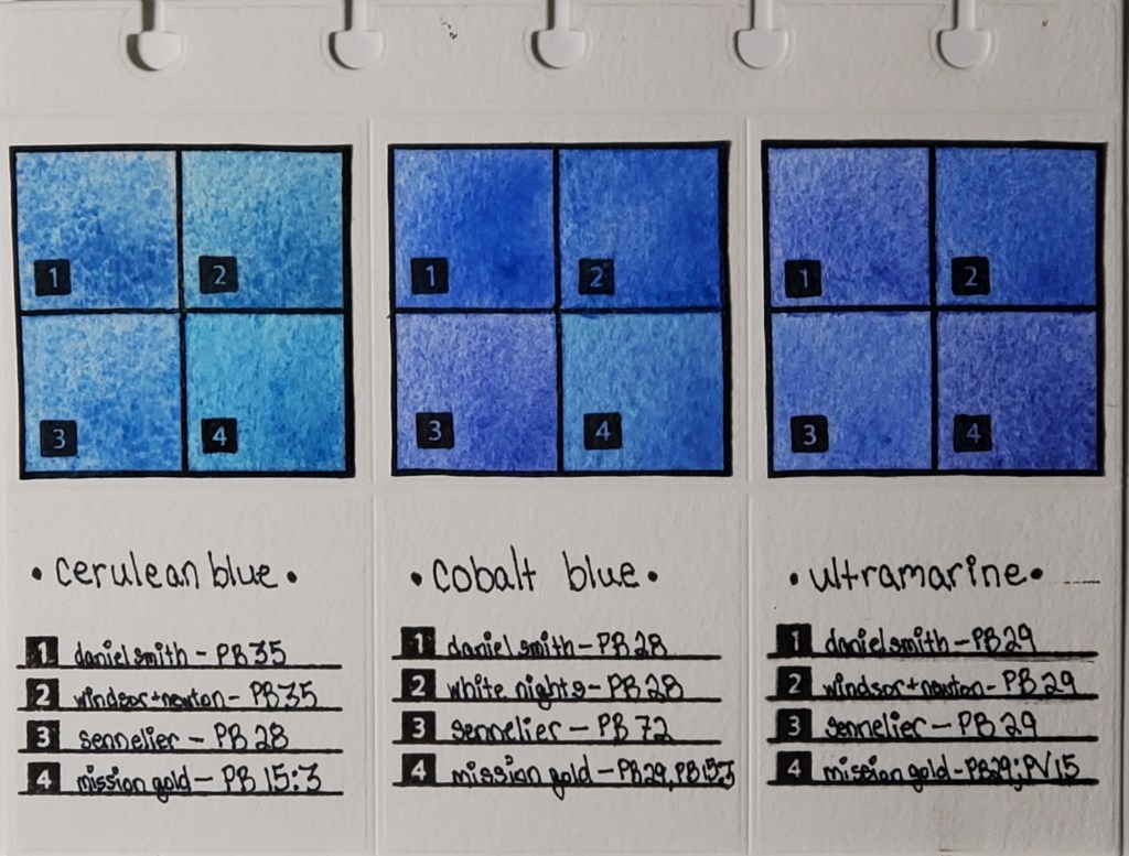
Left to right: Cerulean, Cobalt, and Ultramarine Swatches
I’ve been fascinated with how watercolor paints of the same name vary across brands, even when the same pigment is used. For example, you would expect Daniel Smith’s cerulean blue to look nearly identical to Winsor & Newton’s cerulean blue, right? As you can see from the photo, that’s not the case. I decided to do a study of how colors vary between brands. This deceptively simple-looking page actually took months to finish.
Here is the work that went into its creation:
I cataloged all of my watercolor paints into an Excel spreadsheet and noted properties like pigment number, lightfastness, transparency, staining, and granulation.
I used a die cutter to make swatch cards and the pages which I will eventually bind.
I swatched the paints I wanted to compare. Blues are my favorite, so I started with my most frequently-used
I used silicon stamps to assign numbers to the swatches for easy identification.
After I finish my pages, they are going to be bound in a little flipbook which I’m going to keep next to my desk for easy access to the comparisons.
The most important lesson I learned when I began my research is that color names are less important than pigment numbers. Instead of buying colors based on trade names, I look at the pigment listed on the tube to get a better idea of what the color will actually look like.
Stay tuned for new pigment comparisons! I’ve done swatches for Opera Pink, Viridian, and Lemon Yellow that I’m excited to share!
* I know that I misspelled “Winsor” in the pigment descriptions on the finished page. It will haunt me forever.