Caran d’Ache Gouache Review

I’ve never owned a set of gouache but, based on a glowing recommendation, I decided to purchase a 15-color set of Caran d’Ache Classic Gouache. As soon as I opened the package, it was love at first sight. The presentation is beautiful.

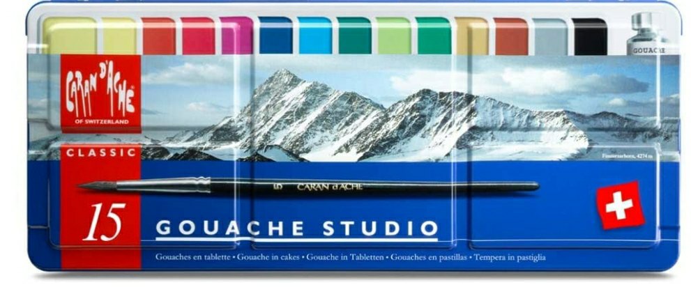
The set comes with 14 colors of gouache and a tube of white. They include a size 8 synthetic brush which I liked very much. There are also 5 large wells on the lid for mixing.

The only qualm I have with the presentation was the absence of color names on the pans. It required a bit of research to identify the colors. The pans include the product numbers on the side in very small print, so I had to find the official chart with corresponding color names.

Caran d’Ache Gouache color chart.

Before I did swatches, I labeled my pans with the information I found for easy identification when I am painting.

My swatches.

I found the pigment information on Wet Canvas which will be helpful when mixing colors. Note that they call product number 090 “Magenta” while the official name is “Purple.”

The Verdict: This is a very useful, versatile set of paints. It contains warm primaries consisting of Yellow (010), Vermilion (060), and Ultramarine (140). There are also cool primaries: Lemon Yellow (240), Purple (090), and Carmine (080). These colors alone will give you a wide range of hues. I anticipate the other colors in the set will produce lovely mixes as well.

Caran d’Ache does it again. I was never very interested in gouache, but I certainly am now.

The Search for the Best Colored Pencil Paper: Part 4 – Stonehenge Hot Press

It’s no secret that Stonehenge is one of my favorite brands of paper. There’s good reason for that – they make high-quality, affordable products. There are also many varieties to choose from with each option coming in a variety of sizes.

Since I primarily make tiny art, I always search for the smallest pads I can find. Legion has many of their products available in mini-sizes. This pad of hot press is 2.5″ by 3.75″ which is slightly bigger than Strathmore Artist Trading Cards. These pads are perfect if you work on a small scale.

I want to spend some time with my set of oil-based Faber-Castell Polychromos colored pencils, so this test of Stonehenge Hot Press only pertains to those.

From the very first pass, I knew I was going to love it. It has the perfect amount of texture for the oil-based pencils, which excel on a medium-tooth surface. Even though I didn’t try wax-based pencils on Stonehenge Hot Press yet, I anticipate it to be a good substrate for those as well.

The Verdict: this an excellent choice for Polychromos colored pencils (and Faber-Castell Albrecht Durer Watercolour Pencils, which I will discuss in a separate review).

Closeup of burnished color. I used a wax-based Caran d’Ache blending stick and a felt burnisher.

Caran d’Ache Neocolor II Swatches

Caran d’Ache products are the crème de la crème of art supplies. Any item they manufacture – whether it be colored pencils, water-soluble pencils, graphite sticks, etc. – is a shining jewel in an art supply collector’s studio.

I was introduced to the brand while meandering through my local art store and stumbling upon a giant open-stock display of Neocolor II water-soluble wax pastels. At the time, I had no idea how to use them, but the vibrant colors beckoned to me. I picked up a tin and went to my studio.

There was a bit of a learning curve. Actually, I’m still learning different techniques. Today, though, I just felt like coloring, so I did some swatches.

I used Arches Rough Watercolor Paper which turned out to be an excellent choice. Because the paper is so toothy, I only needed to make a light pass to get adequate coverage for filling in the squares.

Eventually, I’m going to cut these out and put them in my scrapbook.

The last square is still drying.

Making a Scrapbook…Out of Scraps.

I have a seemingly endless pile of  color-test scraps in my studio that I couldn’t bring myself to throw away. They are so bright that it would be a shame to see them in a trash can.

Papercrafting is one of my other favorite hobbies so I decided to assemble a scrapbook comprised primarily of literal scraps.

A tiny selection of my mountains of scraps

I chose a Ranger Dylusions Flip Journal because the pages are made of thick cardstock that will accept water and ink. I haven’t tested it yet, but I’m fairly certain that it won’t buckle or bleed based on the thickness and texture of the cardstock. I also liked it because it has a thick outer sleeve with an envelope attached to the inside. My only complaint about the journal is that the right-side corners are rounded which makes it difficult to put a decorative border on the edges.

I wanted to put a bright border on the inside and outside covers, so I painted ROY G. BIV squares using my beloved Sennlier L’Aquarelle paints on a long piece of Strathmore watercolor paper. I didn’t want to use thick cotton paper because I wanted to be sure the covers closed correctly.

Highly-pigmented, smooth, gorgeous Senneliers.

After the paper dried, I cut some 1″ wide strips to glue on the edge of the covers. It’s not perfect – I blobbed glue too heavily on one of the strips – but, despite the glue disaster, it turned out well.

Glue splat: lower left corner of the strip. *facepalm*
Inside cover.
Close-up of the inside cover. No glue blobs. I learned my lesson.

I’m probably going to put a few more things on the cover, but this was a fun Saturday project. Stay tuned for my progress!