Mijello Mission White Watercolors Review

I heard about the obscure Mijello Mission White Class in a watercolor product review group and was so intrigued that I immediately purchased a set. They are advertised as a hybrid of gouache and watercolor. The details provided in the product insert explain what this means:

Top of insert.
Bottom of insert.

The set comes with 34 colors in 15ml tubes. The color range is well-balanced, but I was disappointed that black and white paints were not included in the set. If you don’t have white and black gouache on hand, I’d recommend that you purchase them.

The box it comes in is beautiful. I’m a sucker for anything holographic.

Front of the box.

The inside cover provides a list of colors included in the set which is a helpful quick-reference tool.

Inside cover of the box.

Here is the complete set of tubes:

Mijello packs a lot of important information on the individual tubes, which is very helpful when choosing colors. The front of the tube includes the paint’s name, the manufacturer’s number, and the price group. The back of the tube lists the pigments, the lightfastness rating, and the transparency.

Top: front of tube; Bottom: back of tube.

The consistency straight out of the tube is like watercolor, not gouache. I expected the paint to be a bit thicker  but most of the paints are the same consistency as their Mission Gold counterparts.

So, how are these different than traditional watercolors? The answer is…I’m not sure. There’s scant information online and it’s not explained well.

The main difference I’ve observed is that they use bright – sometimes fugitive – pigments so they are less lightfast than other watercolors. If lightfastness is a concern of yours, then you shouldn’t purchase this set. However if you do much of your work in journals, which I do, the lightfastness ratings are not a deal breaker.

Another thing I noticed is that the pigments aren’t consistent with colors of the same name by Mission Gold. For example, here’s a swatch comparing the Mission Gold and Mission White versions of Bright Opera. MG uses BV10 and PR 122 while MW uses only BV 10. I only see a very subtle difference between the two. Mission White is slightly more vibrant.

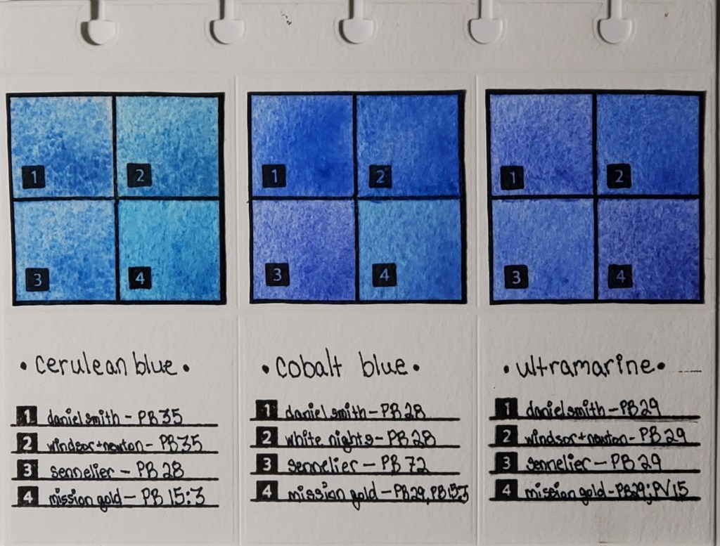
Here’s another example of Cerulean Blue —which isn’t technically cerulean. (PB15:3 is phthalo blue, while PB35/PB36 are true cerulean pigments.) In any case, Mission White adds a pigment – PB17:1 – which is also a phthalo blue. It adds a bit more depth and vibrance, but the difference between the two is not overwhelming.

The Verdict: I’m still trying to figure these paints out. I’m confused as to why they are advertised as a hybrid of gouache and traditional watercolors because only a few of the colors are listed as even semi-opaque. You even have to supply your own black & white gouache. They preform nearly – if not exactly – the same as their Mission Gold counterparts.

My guess is that they want to sell a more vibrant, less lightfast product marketed to people who work primarily in journals or digitize their work.

For this reason, I’m going to add a buyer beware: if you need watercolors that will withstand the test of time, you should avoid these. There are other options for vibrant watercolors, including the regular Mijello Mission Gold paints.

Just Some Pretty Finetec Pearlescent Colors

I just wanted to share some pretty pictures I took of the Finetec Pearlescent Flip Flop Colors. They are so beautiful and fun to play with! They are only available in the 24-set of the pearlescent colors so it’s a good excuse to upgrade!

Finetec Patina Flip Flop
Side angle of Patina showing the chrome effect.
A splat of Patina over Mission Gold Sap Green.
Finetec Twilight Flip Flop
Top view of Twilight.

First Page of my Scrapbook — DONE!

I finished the first page of my scrapbook over the weekend! The most fun part of this project is choosing the right piece of scrap to make an interesting composition.

This scrap on Arches Rough was a tester of Sennelier Indanthrene Blue mixed with Paul Rubens glitter paint and Finetec Iridescent Paint. The background is a wash of Mission Gold Indigo and Sap Green, with a little bit of Daniel Smith Mars Yellow. It looks moody, like tears, and I thought it was an apt way to start my scrapbook. I suffer from depression and art is very therapeutic for me. I don’t want the whole project to display my sadness—I want to keep it upbeat and colorful—but I do want it to be a true representation of who I am.

Anyway, here it is! I was really impressed with how the page of the Ranger Dylusions Flip Journal held up to the watercolor wash.

Watercolor Pigment Comparison Swatches: Page 1

Cerulean, Cobalt, and Ultramarine Pigments

Left to right: Cerulean, Cobalt, and Ultramarine Swatches

I’ve been fascinated with how watercolor paints of the same name vary across brands, even when the same pigment is used. For example, you would expect Daniel Smith’s cerulean blue to look nearly identical to Winsor & Newton’s cerulean blue, right? As you can see from the photo, that’s not the case. I decided to do a study of how colors vary between brands. This deceptively simple-looking page actually took months to finish.

Here is the work that went into its creation:

  1. I cataloged all of my watercolor paints into an Excel spreadsheet and noted properties like pigment number, lightfastness, transparency, staining, and granulation.
  2. I used a die cutter to make swatch cards and the pages which I will eventually bind.
  3. I swatched the paints I wanted to compare. Blues are my favorite, so I started with my most frequently-used
  4. I used silicon stamps to assign numbers to the swatches for easy identification.
  5. After I finish my pages, they are going to be bound in a little flipbook which I’m going to keep next to my desk for easy access to the comparisons.

The most important lesson I learned when I began my research is that color names are less important than pigment numbers. Instead of buying colors based on trade names, I look at the pigment listed on the tube to get a better idea of what the color will actually look like.

Stay tuned for new pigment comparisons! I’ve done swatches for Opera Pink, Viridian, and Lemon Yellow that I’m excited to share!


* I know that I misspelled “Winsor” in the pigment descriptions on the finished page. It will haunt me forever.