Spotlight on a Discontinued Pigment – Genuine Manganese Blue (PB33)

I collect rare & discontinued pigments and Genuine Manganese Blue (PB33) has been at the top of my “To Find” list. According to Handprint, this pigment was discontinued in the 1990s due to the tightening of environmental regulations. As such, all major watercolor manufacturers phased out production of the paint when their pigment supply ran out. Many manufacturers then started offering less-toxic formulations that approximate the original color.

After some hunting, I discovered a company on Etsy called Prodigal Sons Pigments that sells small, handmade batches of genuine manganese blue using PB33. It is pricey: $19 for a half pan and $30 for a full pan. They also sell pure pigment powder if you are interested in making your own paint.

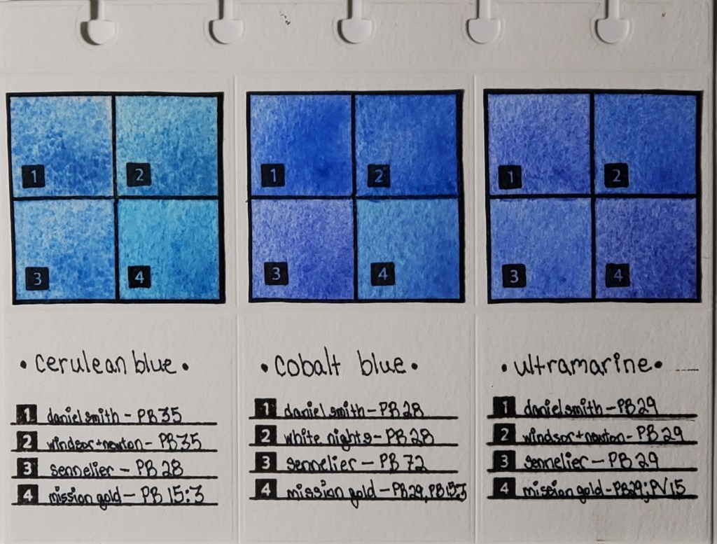
Below are swatches of genuine manganese blue compared with some replacements, including Da Vinci’s version that is a combination of PB15 and PB33.

Without further ado, here are my observations…

The Prodigal Sons Pigments half pan of PB33 is loaded with pigment. Even a tiny dab on the end of your brush goes a long way. The color is what I would consider a perfect cyan and would likely be my go-to blue if it weren’t so precious (and toxic). It’s highly granulating, which is apparent in my swatches below (all done on Arches Cold Press).

The pan was securely packaged with a wax paper inner wrapper and a hand-painted outer wrapper.
Prodigal Sons Pigments filled the pan all the way to the top! This will probably last me a long time because I’ve been using it very sparingly.

This wet-on-wet test is a good demonstration of the color range. You can achieve a very light baby blue or the deep cyan of a vivid fall sky. This swatch showcases the beautiful granulating texture.

Below is a swatch of the Da Vinci Manganese Blue mixture that contains PB33 and PB15. It’s probable that the primary pigment is PB15 due to the mild granulation. It reminds me more of cerulean blue – both in color and granulation – than the genuine single-pigment Manganese Blue shown above.

This is a comparison of genuine Manganese Blue (top) and the Da Vinci Manganese Blue Mixture (bottom). The difference in the color and amount of granulation is quite apparent. While DaVinci’s is still a beautiful color, it is duller than the vivid genuine pigment and is far less granulating.

Many brands offer Manganese Blue substitutes, generally using PB15. Some brands add PW4 or PW6 to achieve a lighter cyan, but I didn’t swatch any of those. I stuck to single-pigment versions only.

The closest match to the genuine paint is Daniel Smith’s Manganese Blue Hue (PB15), although you can’t achieve the same color range as the original. However, it is the only version I tested that granulates. This paint has a permanent place in my palette because it is an excellent choice for a primary cyan.

Turner Watercolor also uses PB15, however it doesn’t granulate. It’s a very pretty color with a good range of light to dark. In that sense, I think it’s a good substitute if you prefer non-granulating paints.

The Winsor and Newton version also uses PB15 and it isn’t granulating. I found the color to be a bit weak and I couldn’t achieve a good range of light to dark. Out of the substitutes that I’ve tried, this is the least similar to the original.

Verdict: As much as I love the genuine Manganese Blue, I consider it a novelty because I use it so infrequently. Not only is it expensive, but it’s also highly toxic. The safer phthalo-based substitutes capture the essence of the original, especially the Daniel Smith version. If you aren’t a rare pigment hunter, PB33 isn’t a necessary addition to your palette.

Side note: I’m going to make the “discontinued and rare pigment” series a regular feature on my blog, so stay tuned for other interesting colors!

Spotlight on a Discontinued Pigment — PB17, Paul Rubens Peacock Blue

I recently bought a set of Paul Rubens Artist Watercolors and, as I was browsing the pigment list, I got a very pleasant surprise. Their Peacock Blue is made with PB17, a pigment reported to have been discontinued years ago.

Here is a screenshot from the Handprint entry on PB17.

The Handprint entry can be found here.

I got out my brush and swatched it immediately.

Paul Rubens Peacock Blue (Product Number A194)

This semi-transparent, non-granulating blue is a perfect cyan reminiscent of single-pigment versions of manganese blue hue but it’s much less saturated than the high-chroma phthalo blues. As noted in the Handprint entry, the tinting strength is rather weak. Paul Rubens assigned it a lightfast rating of 5 on the Blue Wool scale, so it’s significantly less permanent than its phthalo cousins, which are generally rated as 1 on the ASTM scale.

As I was looking through my collection of blues, I found another surprise: the Mijello Mission White Class Cerulean Blue is a mix of PB17:1 and PB15:3. (Note that Mijello does not use an actual cerulean pigment in their “cerulean blue,” but that’s another story for another day.) You can read my review of Mission White Class here if you are interested.

I compared PB17 to some of its green-leaning neighbors to see how it relates to other phthalo blue pigments. I also included a swatch of Holbein’s new formulation of Peacock Blue since it used to be made with PB17. I wanted to see how close their mix is to the original pigment.

Full page of swatches. The long strokes at the bottom and top are Paul Rubens Peacock Blue.

My swatch abbreviations are as follows:

  • H = Holbein
  • DS = Daniel Smith
  • W+N = Winsor and Newton
  • PR = Paul Rubens
  • S = Sennelier
  • MG = M. Graham
Top portion of swatches.

I swatched Holbein’s Peacock Blue because I wanted to see how the new formulation of PB15 and PG7 compares to the original pigment. It’s a pretty close match, although it doesn’t have as much depth as the single-pigment Paul Rubens paint.

Mijello Cerulean Blue is slightly more saturated than Paul Rubens Peacock Blue, owing to the addition of PB15:3. Since Mission White Class paints are billed as bright paints for illustrators, I’m guessing they didn’t opt for a single-pigment PB17:1 paint since the tinting strength of PB17 alone is a bit weaker than PB15:3.

The other swatches are various of green-leaning phthalos and two examples of PB16. The paints using PB16 aren’t a very close match since they lean more teal than cyan.

Bottom portion of swatches.

Overall, PB17 is closer in color to manganese blue than paints using PB15:3. It is also a pretty good match to Sennelier’s Phthalocyanine Blue.

I’m not sure why this pigment was discontinued so I feel lucky to have found this gem. It’s not as practical as a PB15 or PB16 due to its relatively low lightfast rating but I will use it often because I like the color. It’s weaker than phthalo blue green shade but stronger than manganese blue hue. For that reason, I think it would be a good choice for cyan in a CMY palette.

Perhaps PB17 will start to make a comeback! I would love adding a another cyan to my palette.

Discontinued Pigment — PR168

UPDATE 05.28.2021: QoR announced that they have received a new supply of PR168 so their Permanent Scarlet will continue to be produced. I’m not sure if other paint makers will follow suit, but I noticed that several online US retailers have Daniel Smith’s version of PR168 (Anthraquinoid Scarlet) in stock. Hopefully they found a long-term solution to keep producing these paints.

Fans of the pigment PR168 will be disappointed to learn that the pigment has been discontinued by the manufacturer. After the announcement was made, it became difficult to find single-pigment versions of the paints. If you love this pigment or just have been wanting to try it, now is the time to snatch it up before it’s gone forever.

This post from Just Paint that explains the discontinuation in further detail.

Here is a list of some single-pigment PR168 watercolors from https://singlepigmentpaints.com. (If you’ve never visited this website, you should check it out, especially if you try to collect mostly single-pigment paints).

This isn’t an exhaustive list. It doesn’t include some lesser known/lesser used brands.

I own two brands of single-pigment PR168 — QoR’s Permanent Scarlet (listed as “Golden” in the above screenshot and Daniel Smith’s Anthraquinoid Scarlet. They are both vivid colors that are useful for mixing.

I’m in the process of identifying similar colors to use as replacements. Currently, Sennelier’s French Vermillion (PR242) is at the top of my list.

Stay tuned! I’m going to do swatches of other possible replacements and will post them when I’m finished.

Schmincke 140-Color Dot Card

I’ve been putting my feelers out, trying to get an idea of what I want for my birthday this year. I like getting gifts that I normally wouldn’t buy on my own but I like to do research to make sure that it will have a perfect home in my collection of supplies.

I’ve been hearing outstanding reviews of Schmincke Horadam watercolors, but I’ve never tried them out. As it so often does, Amazon pulled through for me by offering a 140-color Schmincke dot card.

The packaging is absolutely lovely.

Outer envelope.
Booklet cover.

One thing that was slightly disappointing was the small amount of paint they give you in each dot. I am used to the generous blobs of paint Daniel Smith offers on their dot cards. Even though the dots are smaller, I think that I will have enough to test the colors and have some left for accents in paintings.

Full card.

I can tell just by the deepness of the dried paint that these are highly pigmented. I’m so excited to start discovering new colors!

First Page of my Scrapbook — DONE!

I finished the first page of my scrapbook over the weekend! The most fun part of this project is choosing the right piece of scrap to make an interesting composition.

This scrap on Arches Rough was a tester of Sennelier Indanthrene Blue mixed with Paul Rubens glitter paint and Finetec Iridescent Paint. The background is a wash of Mission Gold Indigo and Sap Green, with a little bit of Daniel Smith Mars Yellow. It looks moody, like tears, and I thought it was an apt way to start my scrapbook. I suffer from depression and art is very therapeutic for me. I don’t want the whole project to display my sadness—I want to keep it upbeat and colorful—but I do want it to be a true representation of who I am.

Anyway, here it is! I was really impressed with how the page of the Ranger Dylusions Flip Journal held up to the watercolor wash.

Watercolor Pigment Comparison Swatches: Page 1

Cerulean, Cobalt, and Ultramarine Pigments

Left to right: Cerulean, Cobalt, and Ultramarine Swatches

I’ve been fascinated with how watercolor paints of the same name vary across brands, even when the same pigment is used. For example, you would expect Daniel Smith’s cerulean blue to look nearly identical to Winsor & Newton’s cerulean blue, right? As you can see from the photo, that’s not the case. I decided to do a study of how colors vary between brands. This deceptively simple-looking page actually took months to finish.

Here is the work that went into its creation:

  1. I cataloged all of my watercolor paints into an Excel spreadsheet and noted properties like pigment number, lightfastness, transparency, staining, and granulation.
  2. I used a die cutter to make swatch cards and the pages which I will eventually bind.
  3. I swatched the paints I wanted to compare. Blues are my favorite, so I started with my most frequently-used
  4. I used silicon stamps to assign numbers to the swatches for easy identification.
  5. After I finish my pages, they are going to be bound in a little flipbook which I’m going to keep next to my desk for easy access to the comparisons.

The most important lesson I learned when I began my research is that color names are less important than pigment numbers. Instead of buying colors based on trade names, I look at the pigment listed on the tube to get a better idea of what the color will actually look like.

Stay tuned for new pigment comparisons! I’ve done swatches for Opera Pink, Viridian, and Lemon Yellow that I’m excited to share!


* I know that I misspelled “Winsor” in the pigment descriptions on the finished page. It will haunt me forever.