Introducing…Schmincke’s YInMn Blue!

Schmincke’s YInMn Blue

Schmincke just released a limited-edition YInMn Blue watercolor. The only drawback? A very hefty price tag. A 5ml tube will set you back $33 (or $23, if you are able to order from Jackson’s). In the US, there are seemingly only two retailers from which you can purchase: St. Louis Art Supply and Jackson’s. However, at the time I wrote this, Jackson’s was out of stock and only UK customers were permitted to reserve a tube.

This is a quick post to share my first impressions and compare it to the QoR version that was available in 2020 to early 2021. QoR has since run out of their limited supply but, according to their website, they will offer it again when they get more pigment from the manufacturer.

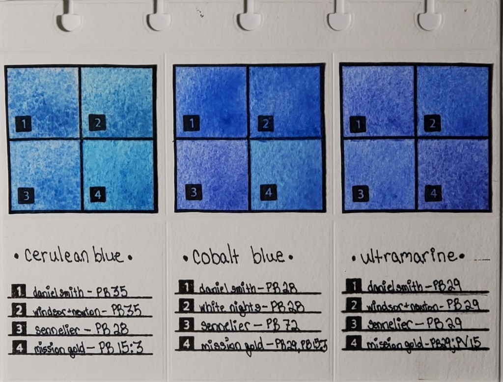
YInMn blue has been described as being in the middle of cobalt and ultramarine. Schmincke’s leans more toward cobalt. It’s granulating, but the pigment particles are smaller than QoR’s. In a pan, it dries a bit gummy and it’s not as easy to reactivate as other Schmincke watercolors.

Schmincke’s YInMn Blue swatched on Arches cold press.

QoR’s YInMn Blue leans more toward ultramarine than cobalt. It is heavily granulating and has a higher pigment load than the Schmincke version.

QoR’s YInMn Blue swatched on Arches cold press.

A side-by-side comparison highlights the differences between the two versions.

Wet-on-wet swatched on Arches cold press.

The difference in color is also apparent when dried in pans.

As a side note, YInMn Blue has been assigned a pigment number: PB86.

Stay tuned for a more detailed post. I’m planning to swatch this next to cobalts and ultramarines to see how it compares.

YInMn Blue: How Does it Compare to Other Blues?

In a previous post, I provided some background on this unique, limited-edition blue available from QoR Watercolors.

YInMn fills a gap between cobalt and ultramarine blue that I didn’t know existed. It is an ultra-granulating, transparent watercolor that runs the spectrum from a light blue-gray to a rich lapis blue. However, due to the semi-weak tinting strength, it doesn’t quite reach the level of saturation as a strong cobalt or ultramarine.

For the wheel below, I chose some ultramarines and cobalts that I thought would offer a good basis of comparison. I used Arches Rough watercolor paper to showcase the granulation of the paints used.

The colors I used are listed below. YInMn fills the center of the wheel.

  1. QoR: Ultramarine — PB29
  2. Daniel Smith: Ultramarine Blue — PB29
  3. Daniel Smith: French Ultramarine — PB29
  4. Winsor & Newton: French Ultramarine — PB29
  5. Winsor & Newton: Ultramarine Green Shade — PB29
  6. Mijello Mission White: Ultramarine Deep — PB29/PV15/PV3:2
  7. Sennelier: Ultramarine Deep — PB29
  8. Sennelier: Ultramarine Light — PB29
  9. White Nights: Ultramarine — PB29
  10. Daniel Smith: Cobalt Blue — PB28
  11. M. Graham: Cobalt Blue — PB28
  12. Winsor & Newton: Cobalt Blue Deep — PB74
  13. Sennelier: Cobalt Deep — PB72
  14. White Nights: Cobalt — PB28
  15. Mijello Mission White: Cobalt — PB28

YInMn looks similar to the colors on this wheel but is different enough to create mixes I have not been able to achieve with any ultramarine or cobalt I’ve used. In a future post, I will be writing about mixing with YInMn. Stay tuned!

Watercolor Pigment Comparison Swatches: Page 1

Cerulean, Cobalt, and Ultramarine Pigments

Left to right: Cerulean, Cobalt, and Ultramarine Swatches

I’ve been fascinated with how watercolor paints of the same name vary across brands, even when the same pigment is used. For example, you would expect Daniel Smith’s cerulean blue to look nearly identical to Winsor & Newton’s cerulean blue, right? As you can see from the photo, that’s not the case. I decided to do a study of how colors vary between brands. This deceptively simple-looking page actually took months to finish.

Here is the work that went into its creation:

  1. I cataloged all of my watercolor paints into an Excel spreadsheet and noted properties like pigment number, lightfastness, transparency, staining, and granulation.
  2. I used a die cutter to make swatch cards and the pages which I will eventually bind.
  3. I swatched the paints I wanted to compare. Blues are my favorite, so I started with my most frequently-used
  4. I used silicon stamps to assign numbers to the swatches for easy identification.
  5. After I finish my pages, they are going to be bound in a little flipbook which I’m going to keep next to my desk for easy access to the comparisons.

The most important lesson I learned when I began my research is that color names are less important than pigment numbers. Instead of buying colors based on trade names, I look at the pigment listed on the tube to get a better idea of what the color will actually look like.

Stay tuned for new pigment comparisons! I’ve done swatches for Opera Pink, Viridian, and Lemon Yellow that I’m excited to share!


* I know that I misspelled “Winsor” in the pigment descriptions on the finished page. It will haunt me forever.