I had a very special helper tonight! My bearded dragon Daisy used her impeccable eye for design to help me pick out colors for bookmarks.


I had a very special helper tonight! My bearded dragon Daisy used her impeccable eye for design to help me pick out colors for bookmarks.
I’ve never owned a set of gouache but, based on a glowing recommendation, I decided to purchase a 15-color set of Caran d’Ache Classic Gouache. As soon as I opened the package, it was love at first sight. The presentation is beautiful.
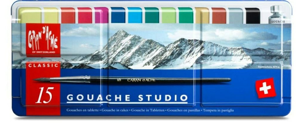

The set comes with 14 colors of gouache and a tube of white. They include a size 8 synthetic brush which I liked very much. There are also 5 large wells on the lid for mixing.
The only qualm I have with the presentation was the absence of color names on the pans. It required a bit of research to identify the colors. The pans include the product numbers on the side in very small print, so I had to find the official chart with corresponding color names.

Before I did swatches, I labeled my pans with the information I found for easy identification when I am painting.

I found the pigment information on Wet Canvas which will be helpful when mixing colors. Note that they call product number 090 “Magenta” while the official name is “Purple.”

The Verdict: This is a very useful, versatile set of paints. It contains warm primaries consisting of Yellow (010), Vermilion (060), and Ultramarine (140). There are also cool primaries: Lemon Yellow (240), Purple (090), and Carmine (080). These colors alone will give you a wide range of hues. I anticipate the other colors in the set will produce lovely mixes as well.
Caran d’Ache does it again. I was never very interested in gouache, but I certainly am now.
I explained how I made these bookmarks in my previous post. As a testament of how easy they are to make with the right tools, I made another one in the same night!
I used colored pencil swatches for this one. The top swatch is Faber-Castell Polychromos; the middle swatch is Prismacolor Premier Soft Core; and the bottom swatch is Caran d’Ache Luminance .

I recently made some Caran d’Ache Neocolor II swatches and wrote about them in a previous post. I used Color Combo stamps from Waffle Flower to print the layouts and spent about 2 hours coloring them in.
If you aren’t familiar with Neocolor II, they are highly-pigmented water-soluble crayons. You can use them dry or activate them with water.


I love making things with my manual die cutter and I have a steel rule die from Waffle Flower (obviously one of my favorite suppliers) that I use to make tags. I decided to use some of these swatches to create a bookmark.
First, I cut out the swatches I wanted to use. Then I glued them to the tag. As a finishing touch, I added a tassel.

I was so pleased with it that I decided to start on another one! It was an easy project when using the right tools.

I’m going to use Caran d’Ache Luminance and Faber-Castell Polychromos to do the other two swatches.
Stay tuned for my second bookmark!

Caran d’Ache products are the crème de la crème of art supplies. Any item they manufacture – whether it be colored pencils, water-soluble pencils, graphite sticks, etc. – is a shining jewel in an art supply collector’s studio.
I was introduced to the brand while meandering through my local art store and stumbling upon a giant open-stock display of Neocolor II water-soluble wax pastels. At the time, I had no idea how to use them, but the vibrant colors beckoned to me. I picked up a tin and went to my studio.
There was a bit of a learning curve. Actually, I’m still learning different techniques. Today, though, I just felt like coloring, so I did some swatches.
I used Arches Rough Watercolor Paper which turned out to be an excellent choice. Because the paper is so toothy, I only needed to make a light pass to get adequate coverage for filling in the squares.
Eventually, I’m going to cut these out and put them in my scrapbook.


Full disclosure: I love every single Stonehenge paper product I’ve tried. They are perfection, plain and simple. The Aqua Cold Press is no exception.


In Part 1 of my search for the best colored pencil paper, I described the differences between the 4 brands of colored pencil I’m using in my test: Caran d’Ache Luminance, Caran d’Ache Pablo, Faber-Castell Polychromos, and Prismacolor Premier Soft Core. The differences between the properties of pencils affect the way they will perform on the paper, so it’s worth a quick read if you aren’t familiar with the pencils.
Before I did a more methodical test, I just wanted to play a bit with gradients of my two favorite pencils: Luminance (wax-based) and Polychromos (oil-based). They both preformed exceptionally well, however Luminance applied more smoothly. It’s worth noting that the scraps I used were trimmed from the edges of a watercolor I was working on and, despite being banged up, they still easily accepted thick layers of color.

Then I moved on to test all four of the brands I mentioned above. From left to right, the colors I used are as follows:


Stonehenge Aqua Cold Press is an excellent choice for both oil and wax based colored pencils. I slightly preferred the wax-based pencils to the oil-based pencils, because they allowed a couple more layers of coverage. The application is velvety-smooth even after several layers of color have been added. There was virtually no wax bloom to speak of. This paper is at the top of my list for both watercolor AND colored pencil projects.
Here is a 🟢 BONUS DOT 🟢 showing 1) light, 2) medium, 3) heavy, and 4) burnished Polychromos application.

After trying typical drawing paper for colored pencils (Bistol smooth/vellum, Strathmore colored pencil paper, etc.) and being unhappy with the results, I zoomed in on watercolor paper as a better option. The texturized surface and thickness of the cotton allow for more layers of color and fuller coverage.
There are so many brands and types to try, which is another reason I’m excited to use watercolor paper for colored pencil art. However, there were certain kinds I didn’t think would translate well. One of papers that I assumed would preform poorly was Arches Rough Watercolor. Spoiler alert: I loved it.

As you can see from the picture below, Arches Rough is heavily texturized. I thought it would be too toothy for colored pencils, but it turned out to be an absolute joy to work with. The toothiness was part of the fun of application.

Here is my test strip, using the following brands of pencils: Carand’Ache Pablo, Caran d’Ache Luminance, Faber-Castell Polychromos, and Prismacolor Premier Soft Core. Refer to Part 1 of this series for a description of the pencils.
Colors (left to right) are:


The verdict: all of the pencils performed well on Arches Rough. The wax-based pencils (Luminance and Prismacolor) worked the best. They applied like butter and resulted in full coverage. I was also able to get full coverage with the oil-based pencils (Polychromos and Pablo), but it took a bit more pressure. The paper allowed for multiple layers of color for each brand of pencil.
I will definitely keep Arches Rough Watercolor Paper on hand for colored pencil art. It isn’t a great everyday paper due to its unique finish, but it will be great for projects where you want to draw focus to highly-texturized objects.
Stay tuned for Part 3 on Stonehenge Aqua Cold Press watercolor paper!
I’m fairly new to colored pencil art and it’s been pretty easy to find review upon review of the best pencils. However, it’s been surprisingly difficult to find reliable information on the best paper to use to make them perform to their full potential.
Since I love experimenting with art supplies, I decided to do my own paper tests. I will be reviewing many types of paper and will share my thoughts here In my reviews, I will be using 4 different brands of artist-quality colored pencils:

Due to the composition of the cores (wax-based vs. oil‐based), I knew each product would preform a little differently on each type of paper. It’s important to know what your pencils are made of before choosing your paper. According to my research, the core composition of these 4 products is as follows:
Wax: Prismacolor Premier Soft Core
Oil: Faber-Castell Polychromos, Caran d’Ache Pablo.
Wax & Oil Blend: Caran d’Ache Luminance
The wax-based pencils tend to preform better on toothier, texturized paper while the oil-based pencils preform best on smoother papers. I’m going to try them all and let you know my thoughts. This exercise will be a great learning experience for me and I hope it will help you too.
Stay tuned for reviews. Sneak peek: the first up is Arches Rough Watercolor Paper.
