Cerulean, Cobalt, and Ultramarine Pigments
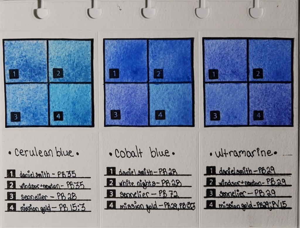
I’ve been fascinated with how watercolor paints of the same name vary across brands, even when the same pigment is used. For example, you would expect Daniel Smith’s cerulean blue to look nearly identical to Winsor & Newton’s cerulean blue, right? As you can see from the photo, that’s not the case. I decided to do a study of how colors vary between brands. This deceptively simple-looking page actually took months to finish.
Here is the work that went into its creation:
- I cataloged all of my watercolor paints into an Excel spreadsheet and noted properties like pigment number, lightfastness, transparency, staining, and granulation.
- I used a die cutter to make swatch cards and the pages which I will eventually bind.
- I swatched the paints I wanted to compare. Blues are my favorite, so I started with my most frequently-used
- I used silicon stamps to assign numbers to the swatches for easy identification.
- After I finish my pages, they are going to be bound in a little flipbook which I’m going to keep next to my desk for easy access to the comparisons.
The most important lesson I learned when I began my research is that color names are less important than pigment numbers. Instead of buying colors based on trade names, I look at the pigment listed on the tube to get a better idea of what the color will actually look like.
Stay tuned for new pigment comparisons! I’ve done swatches for Opera Pink, Viridian, and Lemon Yellow that I’m excited to share!
* I know that I misspelled “Winsor” in the pigment descriptions on the finished page. It will haunt me forever.
