I completed the Schmincke 140-Color Dot Card with the exception of Payne’s Grey Bluish. They forgot to give me a dot of that. This was my first time trying this brand, so I had fun testing the colors. Here are a few quick observations:
The paint dots were less generous than other dot cards I’ve used. I tried to save a bit of each color for mixing experiments and small paintings.
Even with the small dots, I was able to get a good idea of the quality of the paint. It’s deserving of its good reputation.
Determining the performance of the paint, however, was a bit more difficult. I would have liked to have a larger sample to try different techniques on separate paper.
Based on my experience with the samples, I bought several tubes of the colors I liked best. There are some interesting ones like Cobalt Violet Hue (PV62), Cobalt Green Dark (PG23), Mahogany Brown (PBr33), and Quinacridone Red Light (PR207).
Unfortunately the pigment numbers aren’t listed on the card, so I had to look them up myself. I used Jane Blundell’s blog as a reference.
I recently bought a set of Paul Rubens Artist Watercolors and, as I was browsing the pigment list, I got a very pleasant surprise. Their Peacock Blue is made with PB17, a pigment reported to have been discontinued years ago.
Here is a screenshot from the Handprint entry on PB17.
This semi-transparent, non-granulating blue is a perfect cyan reminiscent of single-pigment versions of manganese blue hue but it’s much less saturated than the high-chroma phthalo blues. As noted in the Handprint entry, the tinting strength is rather weak. Paul Rubens assigned it a lightfast rating of 5 on the Blue Wool scale, so it’s significantly less permanent than its phthalo cousins, which are generally rated as 1 on the ASTM scale.
As I was looking through my collection of blues, I found another surprise: the Mijello Mission White Class Cerulean Blue is a mix of PB17:1 and PB15:3. (Note that Mijello does not use an actual cerulean pigment in their “cerulean blue,” but that’s another story for another day.) You can read my review of Mission White Class here if you are interested.
I compared PB17 to some of its green-leaning neighbors to see how it relates to other phthalo blue pigments. I also included a swatch of Holbein’s new formulation of Peacock Blue since it used to be made with PB17. I wanted to see how close their mix is to the original pigment.
Full page of swatches. The long strokes at the bottom and top are Paul Rubens Peacock Blue.
My swatch abbreviations are as follows:
H = Holbein
DS = Daniel Smith
W+N = Winsor and Newton
PR = Paul Rubens
S = Sennelier
MG = M. Graham
Top portion of swatches.
I swatched Holbein’s Peacock Blue because I wanted to see how the new formulation of PB15 and PG7 compares to the original pigment. It’s a pretty close match, although it doesn’t have as much depth as the single-pigment Paul Rubens paint.
Mijello Cerulean Blue is slightly more saturated than Paul Rubens Peacock Blue, owing to the addition of PB15:3. Since Mission White Class paints are billed as bright paints for illustrators, I’m guessing they didn’t opt for a single-pigment PB17:1 paint since the tinting strength of PB17 alone is a bit weaker than PB15:3.
The other swatches are various of green-leaning phthalos and two examples of PB16. The paints using PB16 aren’t a very close match since they lean more teal than cyan.
Bottom portion of swatches.
Overall, PB17 is closer in color to manganese blue than paints using PB15:3. It is also a pretty good match to Sennelier’s Phthalocyanine Blue.
I’m not sure why this pigment was discontinued so I feel lucky to have found this gem. It’s not as practical as a PB15 or PB16 due to its relatively low lightfast rating but I will use it often because I like the color. It’s weaker than phthalo blue green shade but stronger than manganese blue hue. For that reason, I think it would be a good choice for cyan in a CMY palette.
Perhaps PB17 will start to make a comeback! I would love adding a another cyan to my palette.
In September of last year, I was able to snag two tubes of QoR’s YInMn Blue. Several years ago, I learned about the fascinating history of the pigment and was hoping that I could get my hands on it someday. Thank you, QoR, for making my dreams come true.
The interesting story of this new blue pigment began in a lab at Oregon State University. It was discovered by accident by chemists who were working on an unrelated project. It took several years for companies to start producing artists’ paints because the materials (Yttrium, Indium and Manganese) are expensive to procure. An Artnet article explains the history in more detail if you are interested.
Fast forward to 2020 — QoR announces that they are producing a limited quantity of YInMn Blue watercolor, acrylic, and oil paints. As soon as the announcement was made, I called them to reserve 2 tubes. It took a couple months, but they finally showed up at my doorstep.
As far as I know, they are still producing the color in small batches. It is not available in stores, so if you are interested you have to contact QoR directly. You can call them at 800-959-6543 to try to order. The tubes are a little pricey ($14 for a 5ml tube), but they are worth it.
In future posts, I will share my thoughts on the paint but in the meantime, here is a swatch so you can see how beautiful it is.
My very first YInMn splat, fresh from the tube.Look at that dispersion!This is definitely one of the most granulating blues I own.There’s magic inside!
If you are going to try to get some from QoR, I wish you the best of luck! I heard the waiting list is long, but it’s worth it!
I have a seemingly endless pile of color-test scraps in my studio that I couldn’t bring myself to throw away. They are so bright that it would be a shame to see them in a trash can.
Papercrafting is one of my other favorite hobbies so I decided to assemble a scrapbook comprised primarily of literal scraps.
A tiny selection of my mountains of scraps
I chose a Ranger Dylusions Flip Journal because the pages are made of thick cardstock that will accept water and ink. I haven’t tested it yet, but I’m fairly certain that it won’t buckle or bleed based on the thickness and texture of the cardstock. I also liked it because it has a thick outer sleeve with an envelope attached to the inside. My only complaint about the journal is that the right-side corners are rounded which makes it difficult to put a decorative border on the edges.
I wanted to put a bright border on the inside and outside covers, so I painted ROY G. BIV squares using my beloved Sennlier L’Aquarelle paints on a long piece of Strathmore watercolor paper. I didn’t want to use thick cotton paper because I wanted to be sure the covers closed correctly.
Highly-pigmented, smooth, gorgeous Senneliers.
After the paper dried, I cut some 1″ wide strips to glue on the edge of the covers. It’s not perfect – I blobbed glue too heavily on one of the strips – but, despite the glue disaster, it turned out well.
Glue splat: lower left corner of the strip. *facepalm*Inside cover.Close-up of the inside cover. No glue blobs. I learned my lesson.
I’m probably going to put a few more things on the cover, but this was a fun Saturday project. Stay tuned for my progress!
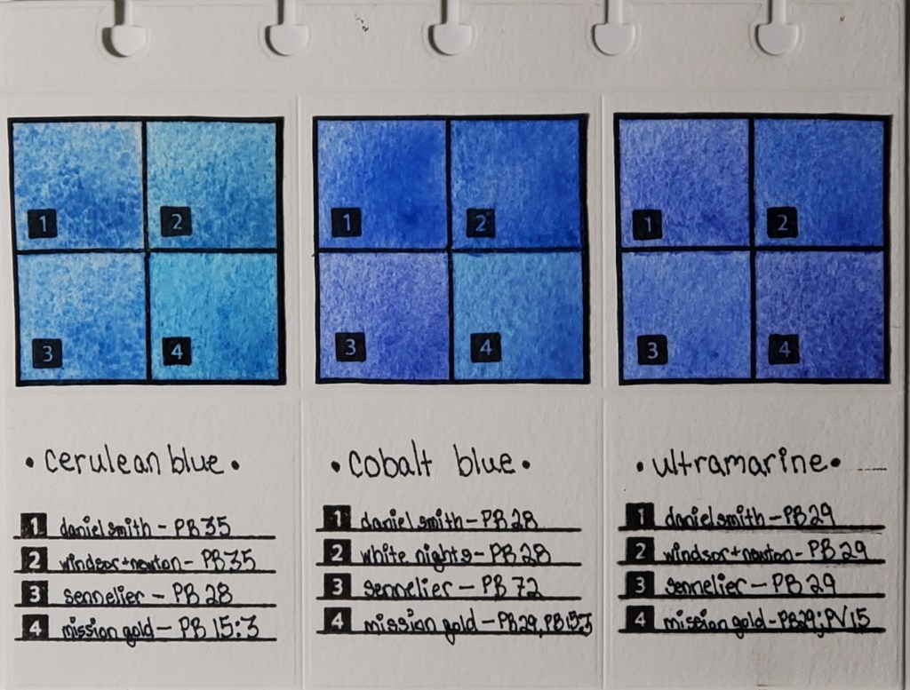
Left to right: Cerulean, Cobalt, and Ultramarine Swatches
I’ve been fascinated with how watercolor paints of the same name vary across brands, even when the same pigment is used. For example, you would expect Daniel Smith’s cerulean blue to look nearly identical to Winsor & Newton’s cerulean blue, right? As you can see from the photo, that’s not the case. I decided to do a study of how colors vary between brands. This deceptively simple-looking page actually took months to finish.
Here is the work that went into its creation:
I cataloged all of my watercolor paints into an Excel spreadsheet and noted properties like pigment number, lightfastness, transparency, staining, and granulation.
I used a die cutter to make swatch cards and the pages which I will eventually bind.
I swatched the paints I wanted to compare. Blues are my favorite, so I started with my most frequently-used
I used silicon stamps to assign numbers to the swatches for easy identification.
After I finish my pages, they are going to be bound in a little flipbook which I’m going to keep next to my desk for easy access to the comparisons.
The most important lesson I learned when I began my research is that color names are less important than pigment numbers. Instead of buying colors based on trade names, I look at the pigment listed on the tube to get a better idea of what the color will actually look like.
Stay tuned for new pigment comparisons! I’ve done swatches for Opera Pink, Viridian, and Lemon Yellow that I’m excited to share!
* I know that I misspelled “Winsor” in the pigment descriptions on the finished page. It will haunt me forever.