Roman Szmal is a relatively new brand of watercolors from Poland. I read many glowing reviews, so of course I had to try them myself. I can confirm: the hype is well-deserved.
Here are some reasons to add this brand to your collection:
The paints are made with a gum arabic and linden honey binder, which makes them smooth and creamy to work with.
They are some of the cleanest, most vibrant watercolors I’ve ever worked with.
Most paints in the collection are single-pigment, so there are endless mixing possibilities.
They offer pigments that are unique to their brand, such as PY168 (Aquarius Yellow), PBk32 (Perelyne Green Deep).
In addition to the unique pigments, they use other hard-to-find pigments that are only available from one or two different brands, such as Azo Red (PR144).
Each batch is made by hand and tested for quality and consistency.
The paints are very affordable, with most full pans costing around $5.
Below are sample swatches of a selection of colors I bought. I could fill up another page with the others! I chose these because they were the ones I was most excited to try.
They are available at Jackson’s Art Supplies in sets and open stock full pans. Unfortunately, the do not come in tubes.
* In February 2022, they added 12 new colors to their already impressive range of products. I will post swatches after I complete them but, I must say, the ones I’ve tried are exquisite! *
I recently bought a set of Paul Rubens Artist Watercolors and, as I was browsing the pigment list, I got a very pleasant surprise. Their Peacock Blue is made with PB17, a pigment reported to have been discontinued years ago.
Here is a screenshot from the Handprint entry on PB17.
This semi-transparent, non-granulating blue is a perfect cyan reminiscent of single-pigment versions of manganese blue hue but it’s much less saturated than the high-chroma phthalo blues. As noted in the Handprint entry, the tinting strength is rather weak. Paul Rubens assigned it a lightfast rating of 5 on the Blue Wool scale, so it’s significantly less permanent than its phthalo cousins, which are generally rated as 1 on the ASTM scale.
As I was looking through my collection of blues, I found another surprise: the Mijello Mission White Class Cerulean Blue is a mix of PB17:1 and PB15:3. (Note that Mijello does not use an actual cerulean pigment in their “cerulean blue,” but that’s another story for another day.) You can read my review of Mission White Class here if you are interested.
I compared PB17 to some of its green-leaning neighbors to see how it relates to other phthalo blue pigments. I also included a swatch of Holbein’s new formulation of Peacock Blue since it used to be made with PB17. I wanted to see how close their mix is to the original pigment.
Full page of swatches. The long strokes at the bottom and top are Paul Rubens Peacock Blue.
My swatch abbreviations are as follows:
H = Holbein
DS = Daniel Smith
W+N = Winsor and Newton
PR = Paul Rubens
S = Sennelier
MG = M. Graham
Top portion of swatches.
I swatched Holbein’s Peacock Blue because I wanted to see how the new formulation of PB15 and PG7 compares to the original pigment. It’s a pretty close match, although it doesn’t have as much depth as the single-pigment Paul Rubens paint.
Mijello Cerulean Blue is slightly more saturated than Paul Rubens Peacock Blue, owing to the addition of PB15:3. Since Mission White Class paints are billed as bright paints for illustrators, I’m guessing they didn’t opt for a single-pigment PB17:1 paint since the tinting strength of PB17 alone is a bit weaker than PB15:3.
The other swatches are various of green-leaning phthalos and two examples of PB16. The paints using PB16 aren’t a very close match since they lean more teal than cyan.
Bottom portion of swatches.
Overall, PB17 is closer in color to manganese blue than paints using PB15:3. It is also a pretty good match to Sennelier’s Phthalocyanine Blue.
I’m not sure why this pigment was discontinued so I feel lucky to have found this gem. It’s not as practical as a PB15 or PB16 due to its relatively low lightfast rating but I will use it often because I like the color. It’s weaker than phthalo blue green shade but stronger than manganese blue hue. For that reason, I think it would be a good choice for cyan in a CMY palette.
Perhaps PB17 will start to make a comeback! I would love adding a another cyan to my palette.
I’ve been putting my feelers out, trying to get an idea of what I want for my birthday this year. I like getting gifts that I normally wouldn’t buy on my own but I like to do research to make sure that it will have a perfect home in my collection of supplies.
I’ve been hearing outstanding reviews of Schmincke Horadam watercolors, but I’ve never tried them out. As it so often does, Amazon pulled through for me by offering a 140-color Schmincke dot card.
The packaging is absolutely lovely.
Outer envelope. Booklet cover.
One thing that was slightly disappointing was the small amount of paint they give you in each dot. I am used to the generous blobs of paint Daniel Smith offers on their dot cards. Even though the dots are smaller, I think that I will have enough to test the colors and have some left for accents in paintings.
Full card.
I can tell just by the deepness of the dried paint that these are highly pigmented. I’m so excited to start discovering new colors!
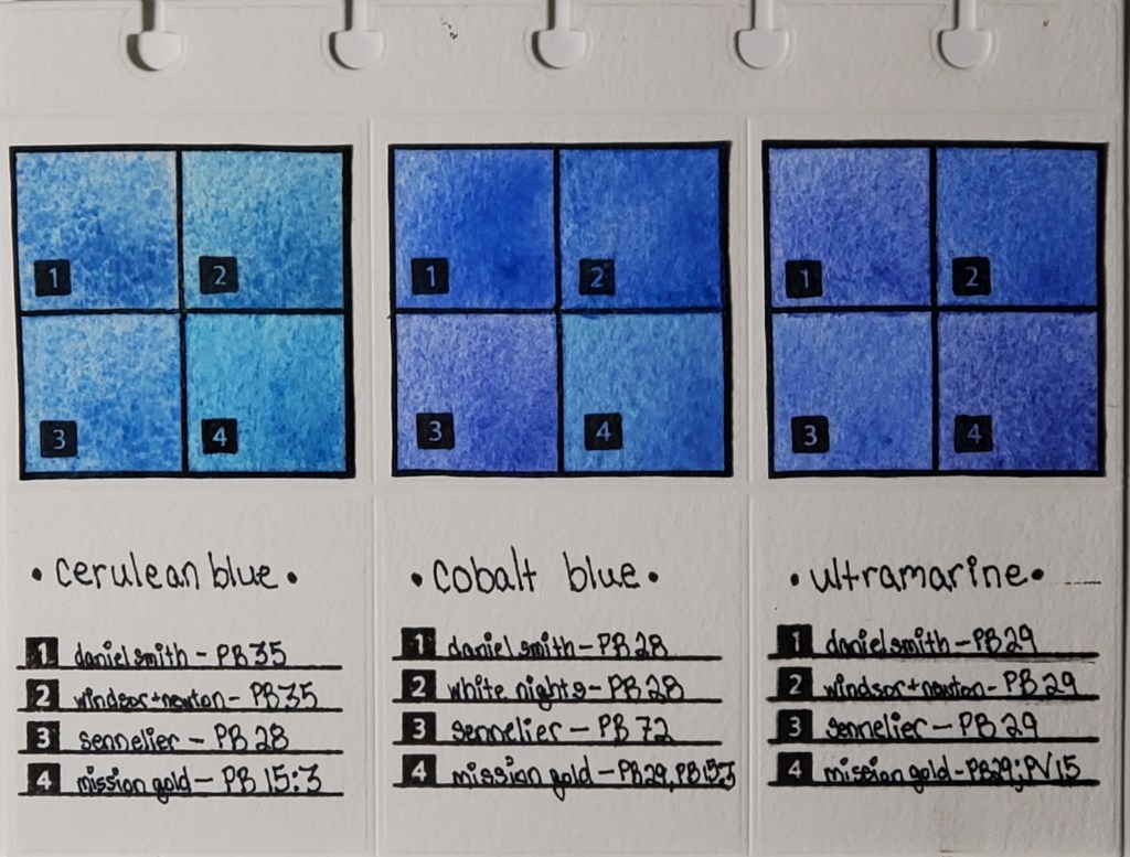
Left to right: Cerulean, Cobalt, and Ultramarine Swatches
I’ve been fascinated with how watercolor paints of the same name vary across brands, even when the same pigment is used. For example, you would expect Daniel Smith’s cerulean blue to look nearly identical to Winsor & Newton’s cerulean blue, right? As you can see from the photo, that’s not the case. I decided to do a study of how colors vary between brands. This deceptively simple-looking page actually took months to finish.
Here is the work that went into its creation:
I cataloged all of my watercolor paints into an Excel spreadsheet and noted properties like pigment number, lightfastness, transparency, staining, and granulation.
I used a die cutter to make swatch cards and the pages which I will eventually bind.
I swatched the paints I wanted to compare. Blues are my favorite, so I started with my most frequently-used
I used silicon stamps to assign numbers to the swatches for easy identification.
After I finish my pages, they are going to be bound in a little flipbook which I’m going to keep next to my desk for easy access to the comparisons.
The most important lesson I learned when I began my research is that color names are less important than pigment numbers. Instead of buying colors based on trade names, I look at the pigment listed on the tube to get a better idea of what the color will actually look like.
Stay tuned for new pigment comparisons! I’ve done swatches for Opera Pink, Viridian, and Lemon Yellow that I’m excited to share!
* I know that I misspelled “Winsor” in the pigment descriptions on the finished page. It will haunt me forever.